Stacey Powell Media
Friday, 10 May 2013
Monday, 22 April 2013
Event - (wildlife)
With this picture of my pond, i have blurred the background a bit so more focus would be on the pond and the fish. I think this photo is good for event as it shows the wildlife of the pond and fish.
I have changed the angle of the photo which i took, so that it shows more detail in the picture, and it shows a bit more about the event (wildlife).
This photo i edited by using dry brush, which then gave it a different texture to what it was before. Which gives the photo more of an interesting photo. By using this its given effect.
NOW
I have changed the angle of the photo which i took, so that it shows more detail in the picture, and it shows a bit more about the event (wildlife).
This photo i edited by using dry brush, which then gave it a different texture to what it was before. Which gives the photo more of an interesting photo. By using this its given effect.
BEFORE
NOW
I have edited this flower photo by using the effect film grain. I thought this effect brought out the wildlife of the flower, for the way its growing.
Friday, 19 April 2013
Portrait
I have used these two photos as a portrait, because the photo has been taken the right way up a portrait photo should be, and it has someone to be used for the portrait. I think these are acceptable to use for a portrait photo because its sensible and clear.
BEFORE
NOW
As these photos are a portrait, i decided to add an effect to the photo and put a frame onto it, as it looks more of a portrait photo by doing this.
I decided to use a last photo of a dog because i wanted to use something different and thought that the dog would make it more interesting and i thought that i had enough pictures of the baby, and couldn't think of a picture that would make it any different to the others. so to have something different i chose my dog.Using this image of a dog makes a photo portrait with something, which is the main image and the photo being portrait.
Monday, 15 April 2013
Concept - (black and white close up's and close up)
These are two close-up photos that i have taken.
BEFORE
NOW
Ive chosen this photo as it goes well with putting the background black and white, and leaving the main image its color.
BEFORE
NOW
Black and white backgrounds works well when you keep a bright image in color, it makes it more noticeable, and more effective.
I have used this as a close up, because its at a good angle and the light shines on the front of the photo, and its dark on the back, which it a good effect for the photo, without editing it, also on the purple rose you can see the texture of it and the lines.
BEFORE
NOW
With this photo i cropped it so you could see the two main images and then put the background black and white and the two main images are left in color.
Wednesday, 10 April 2013
3 categories for photos
The 3 categories i will be focusing on for my own photos is Portrait, which i will be taking a photo of a person as a portrait. Also I've chosen Concept, which will be black and white or close-up photos, and the third category I've chosen is Event which i will be taking pictures of Spring, and the wildlife outside.
Friday, 1 March 2013
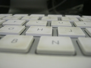
close up's
These are the close-ups i have taken;
Keyboard
A word on a pencil case
Pencil
USB
Tyler's Eye
Apple mac mouse
Apple
My guide to putting pictures on a apple mac from a camera.
Wednesday, 27 February 2013
redesigned photo
For this photo i have cropped it, so that you are focused on the left, and i have also put a different background, so it wouldn't distract you, and look at the background instead of the main focus.
Friday, 22 February 2013
Bad Photo
This is a bad photo, as you don't know where to focus on this picture. There are people who have their backs turned to the photo, and some have their faces turned but focusing on something else. Also with this photo you don't know whether to focus on the right, middle, or left of it.
Monday, 18 February 2013
Own Photos
I think that this photo has a strong line of structure, also a good pattern of the water on the pole, which shows the different pattern styles on it, which makes the photo effective. This photo is also focused on one thing, which is the pole. Also which makes it more effective is that the way the light is on it.
This photo has an all sort of pattern structure, there is a strong structure of the branch, and the others have a thin structure. the lines have curves and have also straight lines. The texture looks smooth, and the colors in the background is light but also dark, which blends in with the branches. The branches are dark, which makes it look as if it should be apart of the photo. I chose this photo because it draws your attention to all of the photo, and you know what it is meant to be. But also it's effective.
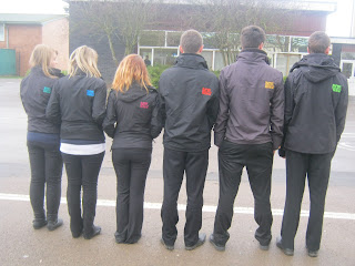
This photo is good because we are showing the different colors, the pattern is good as you can see the pattern sequence with the colors. And also its focused on us, so you know exactly what to focus on. This photo also draws your attention straight to the coats with the colors. And i like this photo because its different.
Friday, 8 February 2013
Photo remake
I didn't know how i could improve this photo in such a way, so i decided that if cutting out the background, people would be more able to focus on us instead of anything in the background which affected it.
Subscribe to:
Comments (Atom)


